Microsoft Payments
As the lead designer for the Microsoft Payments team, I took the open-ended North Star vision to create One Microsoft payments experience and built design product and process that resulted in 3-4x increase in all key success metrics. My work focused in creating consistency and scalability across verticals.
The new Payments experience is live today across several consumer portals and expanding the reach of our new seamless and delightful customer experience during purchase and payments management to commercial platforms.
CONTRIBUTION
Hybrid research and design lead (1 of 1 UX team) working with a PM and a content designer
Starting in Nov 2019 and live to general audiences in June 2020
THIS PROJECT HAS
The end-to-end design process
Strong design advocacy with partner PMs and devs
Usability testing and influence on design direction
Designing for scale and consistency
Turning ambiguity into a clear UX strategy
Problem space
Payment processes have a lot of repeated patterns (think about the pieces of information that you need to use a credit card), so there are affordances to build consistent and scalable experiences. However, the current landscape of Payments experiences across Microsoft surfaces (ex: Xbox, Accounts, Azure, etc.) are fragmented with different look and feel across Microsoft verticals.
Goal
Build a delightful Payments experience that can be scaled seamlessly across every Microsoft platform. Partnering first with Microsoft Accounts, address top support drivers to target success rates of baseline workflows and prove the efficacy of the Payments North Star concept to drive further partnerships with other platforms, bringing Microsoft closer to one, coherent payments experience.
Heuristic evaluation

Lorem ipsum dolor sit amet, consectetur adipiscing elit, sed do eiusmod tempor incididunt ut labore et dolore magna aliqua. Ut enim ad minim veniam, quis nostrud exercitation ullamco laboris nisi ut aliquip ex ea commodo consequat.
Recognition over recall
World and system match
Action hierarchy
Lorem ipsum dolor sit amet, consectetur adipiscing elit, sed do eiusmod tempor incididunt ut labore et dolore magna aliqua. Ut enim ad minim veniam, quis nostrud exercitation ullamco laboris nisi ut aliquip ex ea commodo consequat.
Usability and accessibility review
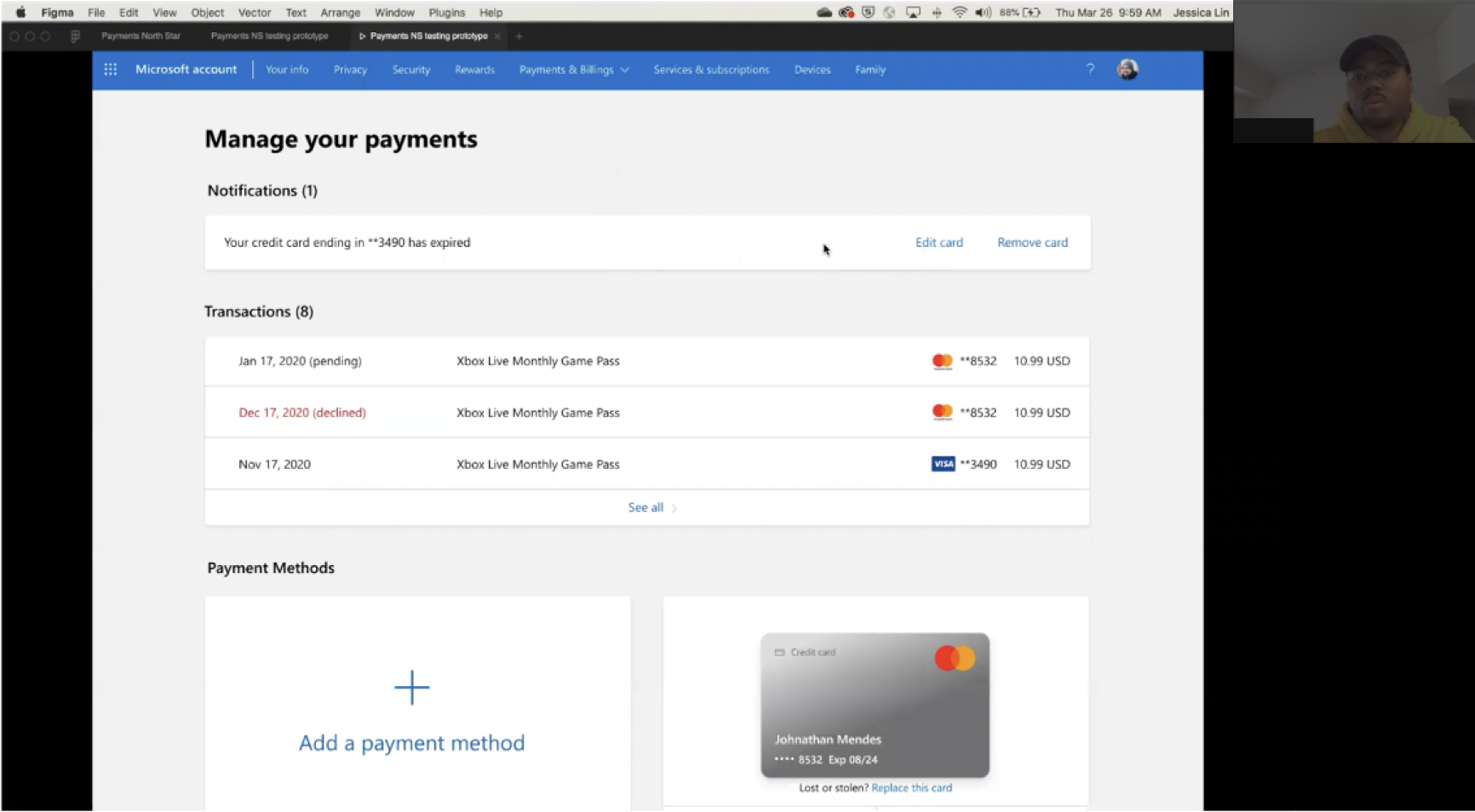
Usability
16 moderated sessions via UserTesting.com
Click-through Figma prototype
Participant feedback
““I use Amazon a lot and I always get overwhelmed with all their links. This is nice and simple and I know exactly where to go to do what I need to do.”
— Study participant
“It’s a really low barrier to learning how
to use this page. I would be hesitant with
a new design but after interacting with it once, I would be confident.”
— Study participant
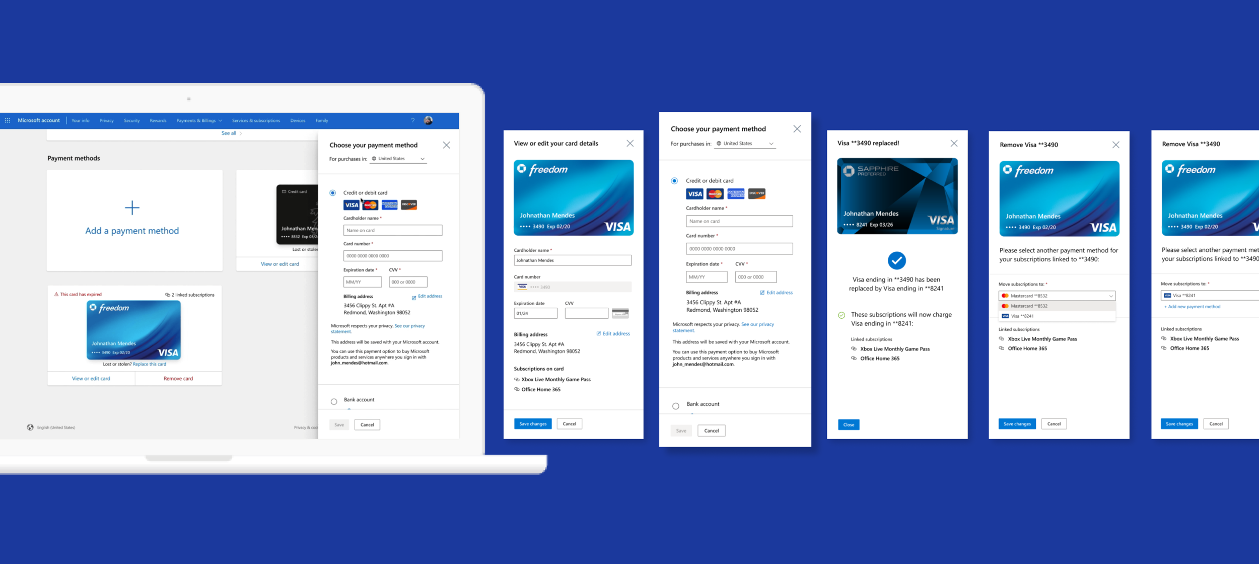
The Redesign
Before and afters for homepage and add flows as examples, you can view the full experience on the Microsoft Account page.
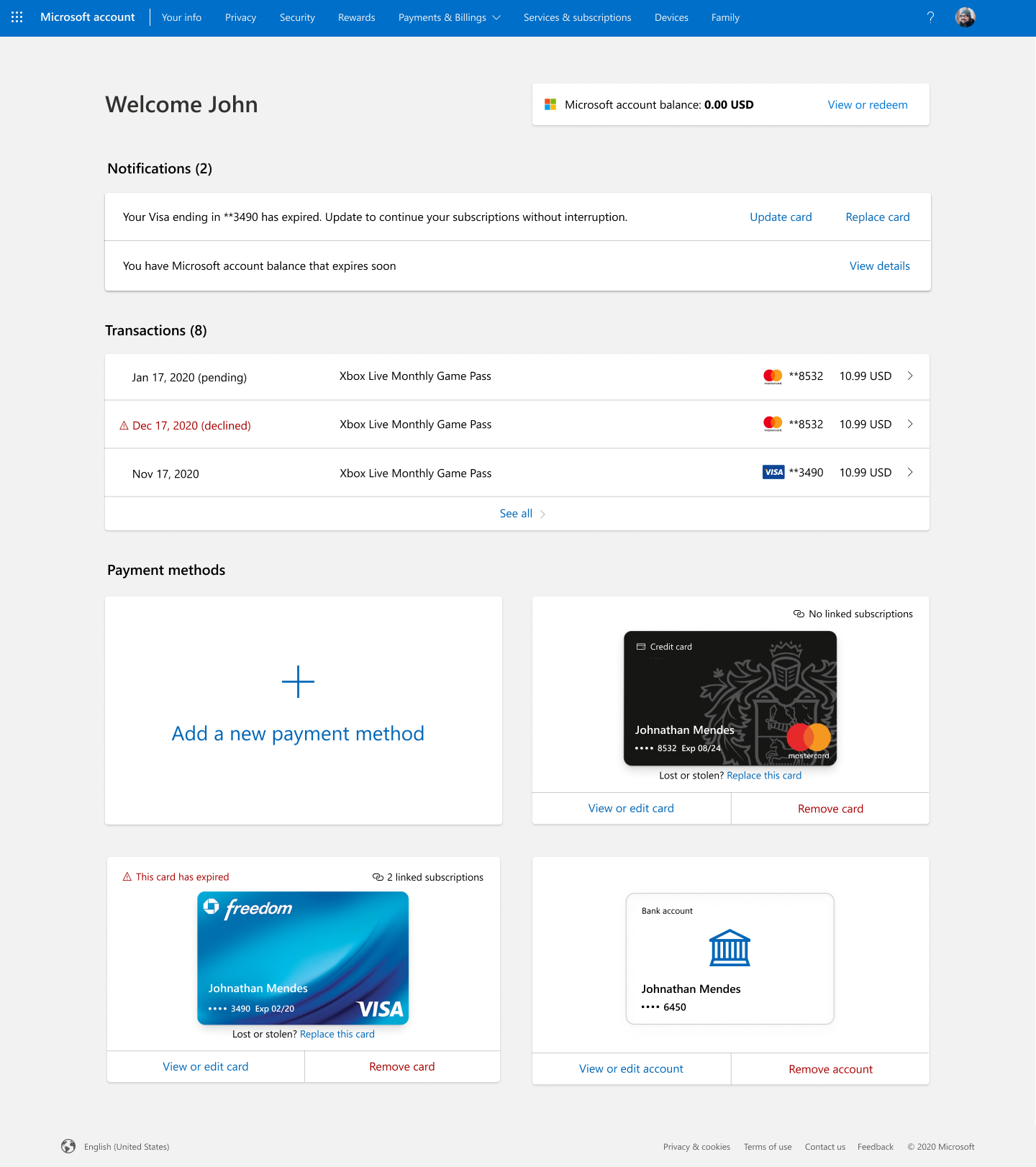
Home before (space needed for 2 PIs) vs. new home page on multiple devices (responsive! accessible! usable!)
Tokenization
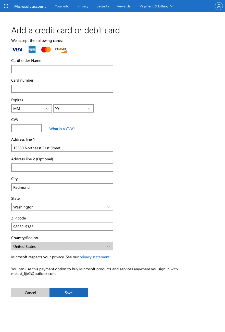
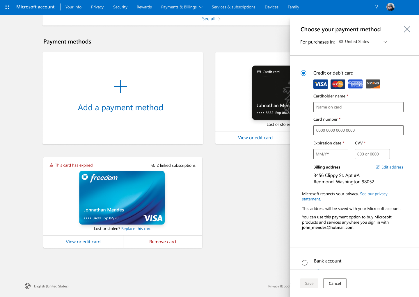
Add before, Add GIF
Layer horizontal of side panel designs
Going GA
Impact: core metrics for Add, Remove, Edit, Replace = 3-4x improvement
This success empowered our team to establish partnerships to leverage this work for other platforms like Xbox, Microsoft Store and Checkout, Windows, Azure, and Microsoft 365. Strong UX influence enabled the Payments North Star roadmap to be realized.
Scott Guthrie feedback
“Although this is a super fast-moving project with critical features and multiple stakeholders to please, Jessica has been on top of things and has the right balance between incorporating feedback while standing up for the correct design.”
— Senior PM, Payments team
Previous project
Xbox Purchase
Next project